OK so you’ve written a book and you’ve gone over it again and again through multiple edits and honed it to the best of your ability, but how do you get people to actually read the damn thing? We’ll talk about marketing in more detail in another post, but one way to get readers’ attention is to have a great cover.
The old adage is wrong, people judge books by their covers all the time, which means this is your first chance to pique the reader’s interest. The cover wants to look professional--that implies that what’s inside will be of a similar standard--and it needs to show the reader what kind of book it is. It’s no good writing a fantastic romance novel if your cover makes the book look more like a horror story. You wont find the readers you want, and those that do click may be disappointed.
If you’re happy with a stock image and simple text, its easy enough to do yourself. Packages like Canva or Kindle's online cover creator allow you to create serviceable covers with minimal artistic skill, but they may not have the wow factor needed to entice readers to buy your book. In my case, as a science fiction author, I felt that the stock images available were quite limited and didn't really reflect what I wanted.
My novel Asura is a techno thriller with some heavy sci-fi elements. I was reading a lot of Matthew Reilly and James Rollins at the time and I suppose I was trying to emulate that kind of book. It is an Airport novel: 120,000 words of action set on the slopes of the Karakoram mountains on the disputed Line of Control between India and Pakistan, so for the cover I boiled this down to three key concepts:
Are you ready for a laugh? Here’s my first attempt
The old adage is wrong, people judge books by their covers all the time, which means this is your first chance to pique the reader’s interest. The cover wants to look professional--that implies that what’s inside will be of a similar standard--and it needs to show the reader what kind of book it is. It’s no good writing a fantastic romance novel if your cover makes the book look more like a horror story. You wont find the readers you want, and those that do click may be disappointed.
If you’re happy with a stock image and simple text, its easy enough to do yourself. Packages like Canva or Kindle's online cover creator allow you to create serviceable covers with minimal artistic skill, but they may not have the wow factor needed to entice readers to buy your book. In my case, as a science fiction author, I felt that the stock images available were quite limited and didn't really reflect what I wanted.
My novel Asura is a techno thriller with some heavy sci-fi elements. I was reading a lot of Matthew Reilly and James Rollins at the time and I suppose I was trying to emulate that kind of book. It is an Airport novel: 120,000 words of action set on the slopes of the Karakoram mountains on the disputed Line of Control between India and Pakistan, so for the cover I boiled this down to three key concepts:
- Mountains
- Sci-fi “thingy”
- Ominous... That’s supposed to tell the reader it’s a thriller
Are you ready for a laugh? Here’s my first attempt
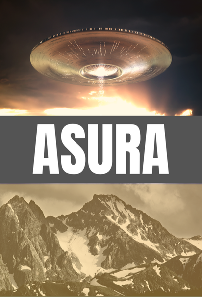
You can see I needed help. Whatever artistic instincts I possess are limited to the written word and apparently my tactic of pasting two stock images together and hiding the join with a big rectangular title block looked less than optimal. (By the way the sepia filter was not an artistic choice: just a ham-fisted attempt to make two very differently coloured stock images look the same.)
Fortunately I had a Plan B.
I’d previously self-published a couple of short stories through Smashwords. Those covers had been drawn by a friend and former college Matt Dobrich. (www.MatthewDobrich.com)
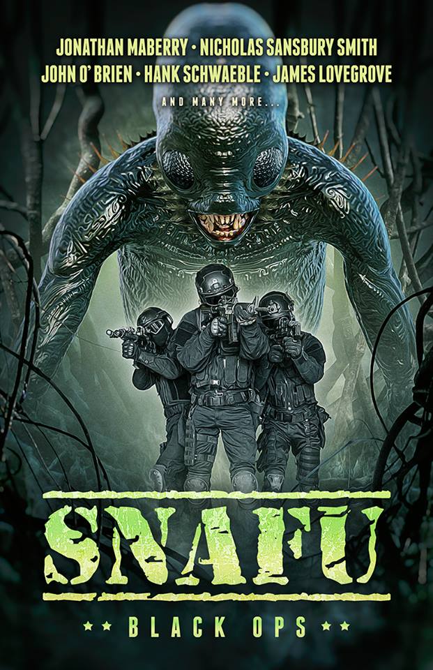
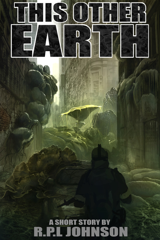
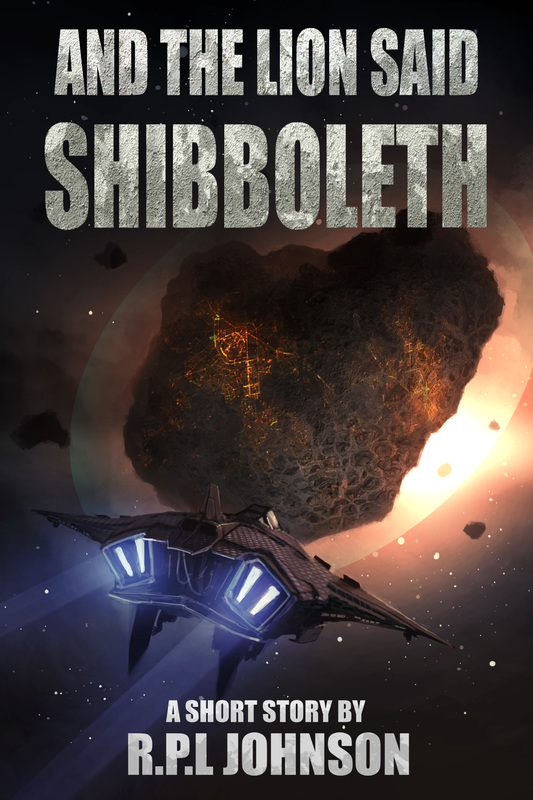
Matt’s a professional draftsman and a great digital artist as you can see from his covers on the sidebar of this blog (he did covers for This Other Earth and And the Lion said Shibboleth). Recently he’s moved away from digital art into the world of traditional oil painting. At first I was on the fence about this. I wasn’t sure that an oil painting style would suit a sci-fi thriller. But eventually I decided to hit Matt up for another cover. He’s a great artist and no matter the medium, I know I like his style.
In the past, I had given Matt excerpts from the stories that I felt captured some image or tone that I would like to see on the cover. But for a novel I feel the best way to work is to explain what you want as best you can and then ask the artist to give you some quick sketches or mock-ups. This saves the artist's time and makes sure you end up with something that you are happy with.
Remember that when you are self-publishing, you are the boss. You are writer, editor publisher and financier. The success of your project depends on you alone, so don't be afraid to be particular about what you want.
With Matt’s permission, here are a few of the early sketches. Remember: mountains, Sci-fi “thingy”, ominous…
Fortunately I had a Plan B.
I’d previously self-published a couple of short stories through Smashwords. Those covers had been drawn by a friend and former college Matt Dobrich. (www.MatthewDobrich.com)
Matt’s a professional draftsman and a great digital artist as you can see from his covers on the sidebar of this blog (he did covers for This Other Earth and And the Lion said Shibboleth). Recently he’s moved away from digital art into the world of traditional oil painting. At first I was on the fence about this. I wasn’t sure that an oil painting style would suit a sci-fi thriller. But eventually I decided to hit Matt up for another cover. He’s a great artist and no matter the medium, I know I like his style.
In the past, I had given Matt excerpts from the stories that I felt captured some image or tone that I would like to see on the cover. But for a novel I feel the best way to work is to explain what you want as best you can and then ask the artist to give you some quick sketches or mock-ups. This saves the artist's time and makes sure you end up with something that you are happy with.
Remember that when you are self-publishing, you are the boss. You are writer, editor publisher and financier. The success of your project depends on you alone, so don't be afraid to be particular about what you want.
With Matt’s permission, here are a few of the early sketches. Remember: mountains, Sci-fi “thingy”, ominous…
But what do you do if you’re not lucky enough to know any artists? Well just typing "ebook cover designer" into Google will give you a multitude of options, but finding one who is good, easy to work with and affordable is not easy. I had had mixed experiences with various online companies, often spending a couple of hundred dollars and never really getting what I wanted. Typically these companies don't offer bespoke art (unless you pay through the nose), but you will get a few artfully placed stock images with enough filters and text to tie it all together.
Another way is to look on sites like DeviantArt. This is particularly good for the sci-fi and fantasy genres. There's a ton of talent out there, just find an image that grabs you and then contact the artist directly through the site. I admit that I haven't tried this method myself, but I have browsed through lots of amazing images that I would have been happy to have used on a book.
Fortunately, I've been able to rely on Matt for Asura. Once we'd agreed on a general theme, Matt did a digital painting to work things out and get colors he was happy with.
I love his use of color in this picture. One problem I had run into with the story was that the mountain setting challenged my descriptive abilities (how many different ways can you describe rock and snow without repeating yourself?) Matt neatly side-stepped this problem by adding a dramatic swirl of color in the sky above the mountain.
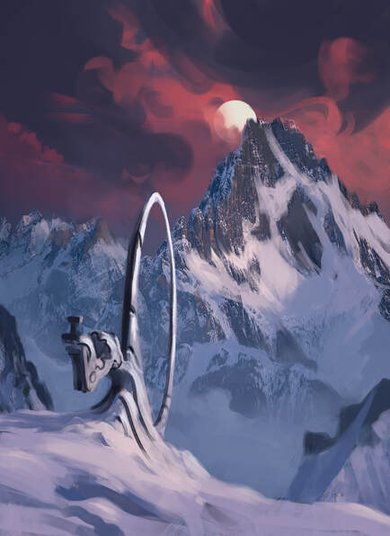
I love this image, particularly the textures Matt's used on the distant mountain.
I would have been quite happy with that image, but Matt is a perfectionist and is currently exploring the world of oil painting. So after the digital mock-up, he started painting for real. You can see his progress below. The great thing about this is that as well as an ebook cover, I get an original piece of artwork to hang on my wall!
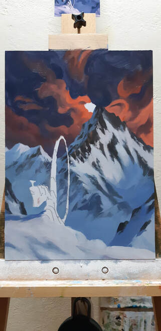
Here's the work in-progress on Matt's easel.
I'll do an official 'cover-reveal' in a later post. But if you can't wait, you can pick up a copy of Asura here.


 RSS Feed